Bussroot is a graphic design company based in Tonbridge, Kent, specialising in branding, digital and creative designs. If you are a new start-up business or already a well-established company, we can make a real difference to your company’s image through creative campaigns and branding. Innovation and responsiveness is our hallmark, alongside our friendly and easy to deal with style, to help you engage and grow.

LOGO DESIGN

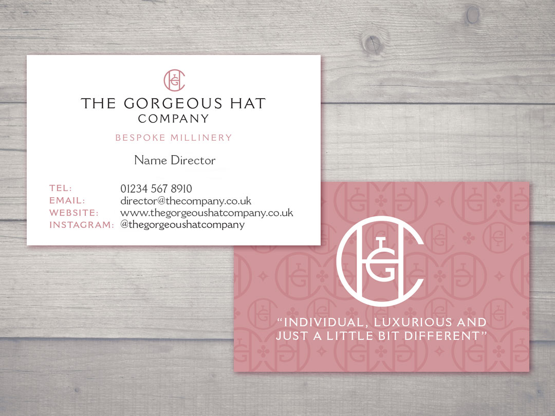
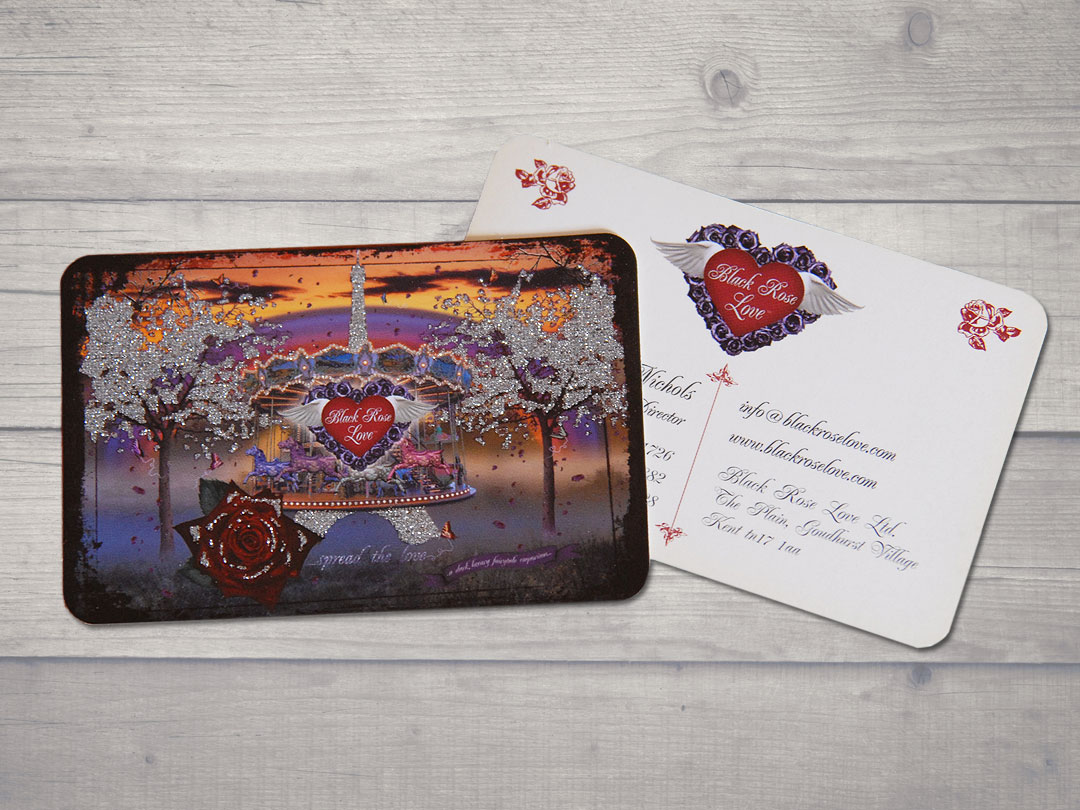
STATIONERY SET

BROCHURES
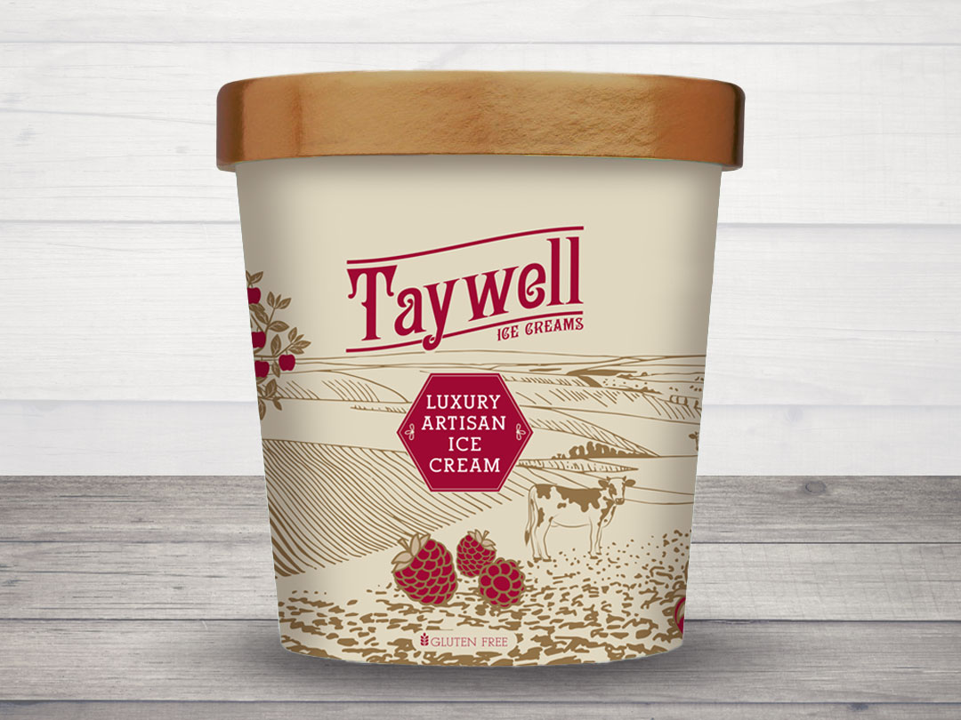
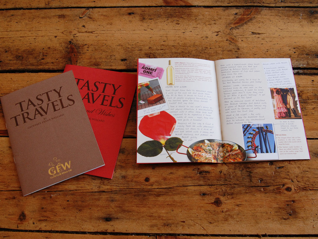
A good brochure should make you proud about what you do. We use clever design, impressive images and illustrations to sell and communicate your message.

WEBSITES
We create good-looking websites with attention to detail and great functionality. Something simple or very bespoke we can use our expertise to make it happen.

EXHIBITIONS
Upcoming exhibition? Then you want an eye-catching design. Roller banners or Foamex boards we have lots of experience in large format design.

FLYERS & LEAFLETS

ADVERTS
The main aim to advert design is getting noticed! We create dynamic advertising campaigns that do just that. Designs to make your message jump off the page!

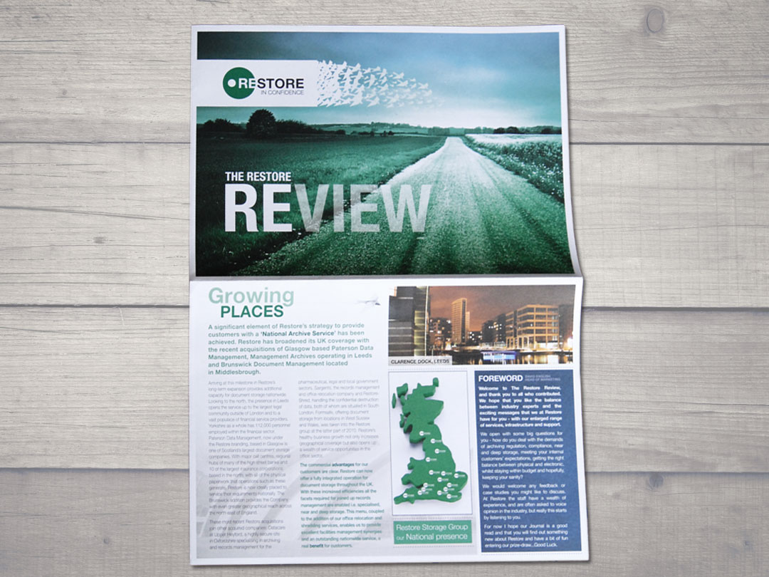
NEWSLETTERS